Monday, November 8, 2010

Calligraphy as a Passion of Words Intwined with Images on the Page

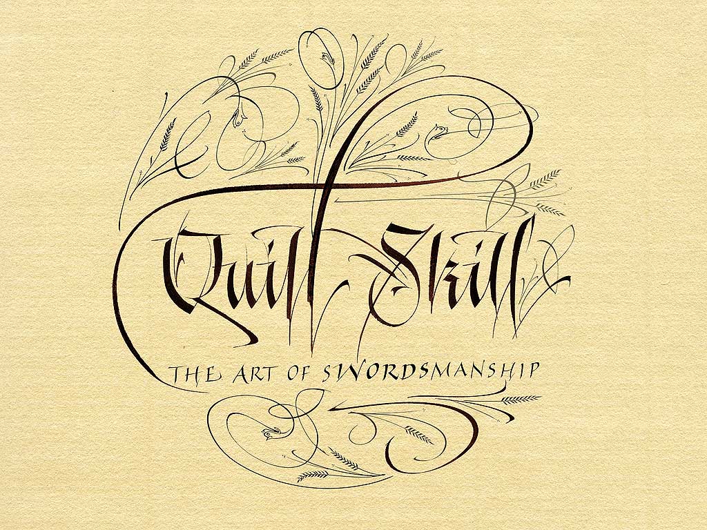
When an artist combines two passions, that of creating letters and images, a beautiful form of expression is born. One well known method of this combination is the art form of calligraphy.
Originating from ancient cave paintings and Egyptian hieroglyphics, the impulse for man to sync letter and image together to create a system of communication has fluctuated in terms of complication and creativeness.  In the early forms of written communication, man used only what today we would classify as images or pictures. The picture below shows the early Egyptians’ form of writing. Obviously, they found something that images could be a successful form of written communication. This is because images can express meaning just as easily as a letter. An ‘L’ can be communicated by two lines, one horizontal and one vertical meeting an angle, and, just as successfully, by a few lines that make up a lion image (as in the Egyptian alphabet). Both are images designed to communicate a meaning from human to human, the only difference is in the society in which the image/letter is used.

More recently calligraphy has become known as a form of art infused within the letters society uses every day. Now able to distinguish between the letter and the image, as opposed to their acting as one in the same, calligraphy enables the artist to communicate beauty along with the worded message. With the invention of the computor, and the various typefaces that came along with it, calligraphy almost met with its extinction; however, humanity has not lost its desire for images to portray beauty, nor the desire to derive meaning from an image. A computer-created font can seem beautiful, but it lacks the honest determination to create something new and wonderful for the world to admire. Mankind will never lose the desire to interpret the meaning behind paintings and sketches. Calligraphy is the evolution and combination of humanity’s form of expression.

Monday, November 1, 2010

Hella Jongerius

Over the summer, my mother and I were rerouted several times while attempting to catch our plane to Ireland. Of course, each time we had to be flown somewhere we had not intended to visit, we were overjoyed, but the one place that really caught my eye was Amsterdam. I was wonderfully surprised to find the beautiful fashions I saw on the people and in the shops in the Netherlands capitol. I think the reason I appreciated this fashion goldmine so was because I had never specifically herd that the Dutch people were exceedingly fashion forward.
While watching "Objectified" in my Design 001 class I was introduced to a designer whose work I found beautiful, unique, and innovative. And wouldn't you know it - she's Dutch! Mrs. Hella Jongerius.
I appreciate the beautiful way she designs vases
she claims she's channeling tradition and modernity when creating a new pot or ceramic. Jongerius made her mark in the commercial industry that all of us can relate too when she won a pitch to design the 1.5 liter Evian water bottle(never marketed). 


This woman shows such versatility in the objects she chooses to design, showing that very little can dissuade or hold her back from letting her designing mind create wonders.


This bath mat is like nothing I've ever seen before, and I feel the repletion and texture she gives to this object elevates it as not only a utilitarian product but as a piece of art.
When designing chairs, Jongerius can create such variety. Two chairs, used for the same purpose; the act of sitting, can be so completely different. As a designer, she shows that she understands the conversation of design between the creator and the recipient with the different ways in which she designs a chair.
This design shows off a sleek and simple form. With it's jet black coloring, the chair exudes professionalism, and with the inventive way that the front legs create an almost seamless line to the back of the chair is fresh and cutting edge. This chair would probably suit some buyer for a high-end company. It's nothing to outlandish to draw attention, but it has just enough subtle edge and beauty that it would be appreciated in an up-and-coming corporate environment.
To show the flip side of this coin, or chair creation, Jongerius can also design a chair that is just as much new thought and simplicity, but catered to a whole different crowd.
The bright red coloring of this stool shows that it is meant to make a statement in a room. Noticeable both for its shape and color, this simple but intriguing seat would do well in a younger person's room, maybe a dorm room in college. The brightness and new shape shouts independence and individuality.
One purpose. Two very different designs. One innovative woman.

Industrial Design: Unity in Form


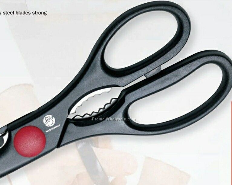
      I have a pair of stainless steel kitchen sheers sitting on my desk. As a highly useful product, it is no wonder this tool is mass produced. While many of the attributes of its design were chosen for their logical usefulness, others, like the achromatic black coloring, were chosen for aesthetic purposes. The asymmetry of the handles was incorporated in order to fit a hand more comfortably (as one handle holds four fingers, the other one, one handle is naturally longer with more room than the other). While a practical choice, there is no doubt that a certain unique visual dynamic is given to a piece of art or industrial object when asymmetry is part of the design.
      The serrated edge on one of the scissor's blades along with those in between the two handles show a pattern, repeating this module of the object in an anticipated sequence. The serration is important for the scissors to cut through tough foods in the kitchen, such as chicken bones. The designers could have stopped the serration half-way down the blade and the tool could have retained the ability to cut chicken bones, but this would be less aesthetically pleasing, so there was no reason to do so.
      The entire form of the kitchen sheers create unity. Without the asymmetrical handles, or the black coloring, or the serrated edge, the scissors would not be the successful product that they are today. A success for the industrial designer; “I like to look at it and I like to use it”!

Interaction of Content and Form in "Objectified"


      Understanding the historical content for a design idea helps us to see the reasoning behind its form and formation. In Gary Hustwit's documentary “Objectified”, 
      a designer makes the connection that the main goal of industrial design is mass production.The concept of industrial design in and of itself was an interesting topic for me. I had never really put much thought into the fact that the curve of the handle that most gardening sheers are built with these days is very helpful to me and makes them much easier to work with than old, straight-handled clippers. The design of the every-day world had never struck a chord with me while I was to busy being hypnotized by the in your face design content behind such things as fashion.
      What really grabbed my attention was when design editor, Alice Rawsthorn, brought up a historical reference as to why mass production was so key in the success of industrial design. The first emperor of China ran into a problem when he was waging war when attempting to expand his empire. If an archer died in combat, another archer could not utilize the dead man's arrows because they had been made to fit only his bow. In order to neutralize this problem, the emperor “came up with a way of standardizing the design of the arrows so that each arrow would fit any bow”, Rawsthorn explains in an interview.
      When the historical content of a major design descision is explained more understanding can be reached when observing a designed object as to why this form was chosen over that.

Sunday, October 17, 2010

Design in the Library

Design really can touch every element of your life. When at the library I noticed that every book tells a story based on its cover design. Of course, everyone has heard the old adage “don't judge a book by its cover”, but it is no secret that everyone does. This is due to the design of the cover page. Once again, my little-girl-idea that design=fashion=clothing failed me; and I could not have been happier to make another design discovery, or rather, realization.
For instance, I'm here looking at a book for my sociology class, and due to the design of its cover I can generally categorize it as a informational book or textbook.
This is an immensely helpful design because imagine my dismay if I was to search the library for a fantasy novel with adventures and romances, and every book looked like my sociology book. It would not be as easy to tell which book I want. I might be stuck desperately searching for a wonderful romantic story between this sociologist and that one. Oh, calamity!
Even the design of a book cover in the genre you prefer can help you decide between this novel and that. I'll be the first to say that when searching for a good read I'll pick a novel with a man and woman kissing on the cover over one with a man is a space suit and a gun. If a cover is creatively layed out, instead of just a beautiful image it includes a great picture, an interestingly placed title and different elements on a cover, this design will pull me in.

Comparison and Contrast

When comparing the clothing worn by women in the pre-WWI and post-WWI eras it seems that clothing was not only chose for practical purposes, but as ways of expression as well. Not much has changed in the fashion industry since then in terms of the basic reasons why women wear what they wear.
Prior to the start of World War I women wore long dresses with narrow waists and were full at the front (which became known as the “pigeon breast”). Shoulders were broad with large sleeves, and the dresses had stiff collars. The style of the 1890's-1910 was the traditional womanly figure, or the “hour glass” figure. Also, this was the final showing of the corset as a necessary part of every woman's daily outfits.
After World War I women began to change their appearance. This became the “Flapper era”, when women began to show rebellion against the fashion traditions of the time before the war. “Three important factors converged which would have an impact on American fashion: the ending of World War I, the feminist movement, and improved production methods”. Women wore cropped hair styles and short skirts. “After World War I women's fashions reflected a new more carefree attitude”. The corset was neglected and dresses were made that showed the natural waistline, or sometimes no waistline at all as with the “shift” dress. Because of the major growth in the clothing industry after the war was over, dress designs were simplified and mass-produced at lower prices. The flowing dress style was adapted by most women in society. Designs were made more practical and fitting with the desire for a carefree lifestyle after the war.(http://books.google.com/books?id=hRHUOxramGEC&pg=PA45&lpg=PA45&dq=flapper+dress+1920+feminist+movement&source=bl&ots=fJraBnPD6_&sig=nZ0w-5Ai06NxinloQeYspBokwX0&hl=en&ei=3LO7TPHCII24sQPNv4zzDg&sa=X&oi=book_result&ct=result&resnum=1&ved=0CBkQ6AEwAA#v=onepage&q&f=false)

Design as Conversation

At first mention, I thought this statement was a bit of a stretch. Sure, design could be a form of communication just as conversation is, but it could not be so broadly conceptualized as to encompass all that conversation is. I failed to see design as conversation because I considered conversation an entity that involved two sides, and at first I did not see the other side half of the conversation; I only saw the Designer.
I realize now that design is a conversation between the designer and the consumers. The designer cannot simply make an article of clothing or a graphic in a motion picture, the creation must be acknowledged by its audience. Even if the design is received poorly, with everyone who sees it going on a ten minute rant about it's disappointing qualities, design is still a conversation. An unhappy conversation, but the designer made his or her point and the recipients gave their thoughts on the topic.
Without the recipients design would be nothing. We design in order to make society run easier, be it easier on the eyes or an easier way to pick up the water bottle because of the design of the grip. Most recently the redesign of the GAP logo showed how vital the conversation of design is. GAP felt the need to create a fresh new logo. This may have been because those in charge felt they needed a new look in order to keep up with the young, up-and-coming store, but whatever the reason for the change the viewers were not buying what they were selling. Within a short time span the population made it known how little they thought of this new GAP logo, how they thought it was both unattractive and unnecessary. Following these complaints, GAP retracted the new look.
Another design conversation would be the that which Lady Gaga has with her audience. With all of her eccentric looks, Lady Gaga is certainly making statements. The singer is attempting to send messages to her viewers both through her music and through her attire. At the 2010 MTV Video Music Awards, Lady Gaga wore a dress made of meat. This choice is a perfect example of the miscommunications that can come with the conversation between the designer and the recipients. Lady Gaga chose to wear the dress to protest the military's “don't ask, don't tell” policy, but some who viewed the dress, not understanding the message the designer was attempting to get across, sent angry messages to the songstress. “It's certainly no disrespect to anyone that's vegan or vegetarian… it's [saying], 'If we don't stand up for what we believe in, if we don't fight for our rights, pretty soon we're going to have as much rights as the meat on our bones”(http://www.holamun2.com/news/quote-of-the-day/quote-of-the-day-why-lady-gaga-wore-a-meat-dress-to-the-vmas), Gaga told Ellen DeGeneres on her talk show.
Without the proper communication between designer and those who view and use the design the world of design would come tumbling down. Just like in any good conversation between two parties, messages need to be clear and well put together in order to have a successful interaction.