Monday, November 29, 2010

Design is Dangerous: Just in the back of your minds...


I remember when I was about eight years old 'Heelys' were all the rage in my hometown. These shoes jumped to the top of every kid's christmas list in 2000-1 including my own. All of my friends wore there Heelys everyday, the neighbor kids would be whooping and hollering next door as they would pop the wheels out from the soles of their sneakers and glide across the ground.
In the beginning, the fad seemed harmless and a good new way for children to have fun. However, as I look back on it now, I wonder if there really was no damage done with these fun little rolly-shoes. If done at all, it's true the damage was not catastrophic. The kids didn't really know any better, they only saw a fun and faster way of getting from point 'A' to point 'B'. But these shoe-toys provided an excuse for laziness. No longer needing to walk along with their parents in the mall, the kids could roll alongside and not exert themselves at all.
Many may see this as an overreaction, and I acknowledge the seemingly silly idea I'm bringing forward, but I also see that with this huge surge in children's need for this way to keep themselves from working their legs even the slightest, a seed was planted in their minds.
With the creation of these Heelys, my generation was shown that with the right mindset, we could create anything we wanted to keep ourselves from exerting too much energy. And how much is “too much”? Who decides how lazy we get to become? With that memory wheeling through our head, in the future we might design the long-awaited hover chair! Heelys showed that creating a way to nix all physical exertion was just a little too easy.
Alright, so it's a little extreme, but the clip shown above from the Disney movie Wall-E just shows how design could hurt us if we don't show the proper restraint.

Design in Society: Harry Potter and the People Tree!

    Here ye! Here ye! The Harry Potter franchise has performed a service to its audience (that is, apart from the fantastic entertainment that is already served up, if I do say so myself!)! By hiring an actress that shows an environmental and social conscious, the films have provided a link for die-hard fans between the world of Harry Potter and that of eco-consciousness.
    I was viewing actress Emma Watson's official website (http://www.emmawatson.com/) earlier this week because I wanted to see what her next acting project would be after the Harry Potter series was officially wrapped up. I came across a link that showed all the 'projects' Watson actively involves herself in. Mostly related to fashion, this actress gets involved in a multitude of projects and doesn't just lie around or wait for things to happen. She gets things done!
    Her collaboration with People Tree, the sustainable and fair trade clothing brand, was her effort to open a few more of the eyes of the younger generation to the benefits of buying from brands that show consciousness of the problems in the world and have a mind to fix it.
    People Tree is a Fair Trade fashion line whose focus is to bring global awareness to fair trade practices. Eighty percent of the collection uses 100 percent organic, fair trade certified cotton coming from disadvantaged communities in Bangladesh and Nepal. The royalties made from the collection will be donated to the People Tree Foundation, an independent charity working with People Tree” (http://hollywoodcrush.mtv.com/2010/02/03/emma-watsons-eco-clothing-line-for-uks-people-tree-premieres-this-week/).
    In case you're unaware, Fair Trade Certification is a series of hoops that manufacturing companies have to jump through if they wish to sell their wares with the stamp that says they were made in a way that treated workers and the environment in a courteous and fair way (http://en.wikipedia.org/wiki/Fairtrade_certification#Fairtrade_standards).
    With the fame she attained through her lengthy participation in the Harry Potter film franchise, Miss Watson has found the funds and attention needed to partake in a project that she believes is important, with the added bonus of being able to utilize her creative/artistic side as a “creative advisor” on the project.I wanted to help People Tree produce a younger range because I was excited by the idea of using fashion as a tool to alleviate poverty and knew it was something I could help make a difference with. I think young people like me are becoming increasingly aware of the humanitarian and environmental issues surrounding fast fashion and want to make good choices but there aren’t many options out there” (http://www.emmawatson.com/en/Projects/People-Tree/).

Color Transforms: The Tie-dye Shirt Phenomenon

Color has a rather under-glorified role in society today. Many think of it as something that would definitely be noticed if absent from every day life, but certainly not a thing to be marveled at from day to day. Perhaps to marvel would be a bit much, but surely a bit of notice is merited to the noble form of expression that is color.
Lauer and Pentak discuss in their book Design Basics the importance that color holds for us in the world, saying “color appeals to our emotions and feelings”. With design being a form of communication between multiple parties, it makes sense that no way of expression would be left unused by the designer in his/her attempt to bring an idea to light or across the space between the producer and consumer of the design. Color is one of those methods of expression. And it may mean different things for different cultures or generations, but without color, we as players in the game of life would have a more difficult time expressing how we feel, what we see, not to mention combining the two to make art. Plus, the world would be a pretty boring one if washed in grayscale!
Color and design can also be a form of communication from person to person not only in the professional setting of producer/consumer. Between one generation and another, color can be an explosion of opinion and voice for those who need a way to express frustration or even dissension. The tie-dye shirt was an outburst from the younger generation in the late 1960s, as a visual way of communicating opinions and the belief that they needed to shake things up!
Tie-dye came back in style in the 1960's when a great movement emerged among young people that emphasized individuality. It was time to "do your own thing." Each person could make a statement by tie-dyeing clothes with a personal combination. Tie-dyed sheets were used as room dividers and wall hangings. Silk and cotton banners were used as backdrops for rock and roll concerts” (http://www.harmonytie-dyes.com/_special/history.html)
Colors evoke and inspire communication, but they can also be the form it takes. For some who have a quieter voice than others in this world, color can be the most important thing; the thing that enables them to show their true selves,beliefs, and thoughts to the rest of humanity. Design and color can work together to reach a mutual goal, but can also work separately. Either way, both can be a method of expressing freedom!

Monday, November 15, 2010

Have fun, designers! Have fun!

Sometimes the industrial design of an object becomes unnecessary in larger society, this happens rarely, but I noticed it one day when I was visiting my mom's office. On one of the buildings' walls was a clock that had the standard minute and second hand tic-tic-ticking away the time, but the numbers were all piled at the bottom and a big "Whatever!" was plastered across the face of the clock.
This mass produced product shows that in some social environments the designs that we thought hold us afloat every day, when replaced with a new witty or ironic design, may be able to be put to the same use but with a fresh look and design.
Now to be fair, when I was younger this clock always frustrated me to no end. I would walk past it and each time look up with confusion. I wondered, why would someone make such a useless object?! For a fourth grader, who has enough trouble telling time on one of those darn round clocks anyway, this little creation here was simply preposterous, though the bold expletive I found enjoyable even through my irritation!
This proves that the usefulness of industrial design will never really go out of style, due to the need of the simple and practical in various stages of life. These industrial designers were probably the ones behind the design of the digital clock anyway, due to their understanding of the need of some for a simpler way of telling time.
However, as the setting  matures, there is certainly  no problem with throwing in a little humor in to replace something that has been rendered unnecessary in the current environment! Have fun, designers! Have fun!

Ergonomics

The car company Toyota has built up a loyal and supportive crowd of followers over the years. With their reliable cars, efficiency, and constant innovation, Toyota quickly lured many car-buying-hopefuls to its dealerships. This was a company trusted and respected by its consumers. That was all good and well, until 2007 hit.
If Toyota was planning to produce reliable products with the ability to be put to good use by the public, they should have gone down the check list of everyday ergonomics one more time. A hierarchy of rules is useful in order to build a profitable product, and starting in the 1930s "Toyoda", the company's initial title, was the automotive star everyone wanted to hitch their bandwagon to.
The original heads of the company valued the organized system of following the basics of ergonomics, and the profit that naturally followed. With 'safety' as a solid base-rule for building its vehicles, its no wonder Toyota rose to power and popularity so quickly. First building trust with consumers in Japan, Toyota didn't skip steps for company quick saves or cut any corners. The original bosses understood the design conversation between producer and consumer and built their vehicles in accordance to the ergonomic expectations of their buyers.
With 'safety' as the number one prioritized thought behind building all of their cars, all cars were sold with the assurance that the families entrusted to their automobiles would be in good seats. With 'comfort' as the next area of ergonomic necessity, Toyota also made sure that those seats were made in the most comfortable form possible. Showing consideration for their buyers, Toyota never made a drivers seat out of a plank of plywood, but cushioned and formed to fit the contours of a human body, their cars were made with thought of what would be most comfortable to the driver and passengers.
'Ease of use' and 'performance' were obviously key ingredients in the Toyota stew of success back in the day, but perhaps, more recognizable to consumers today is the incorporation of those next rules of ergonomics in their famous (soon to become infamous) Toyota Prius. A button to start the car's engines made the use of the car key virtually obsolete, and this  nifty little detail sparked consumers' interest and left other car companies in the dust. Adding GPS systems in the cars was just icing on the 'ease of use' cake.
The 'performance' step of ergonomics (a step that I believe should be a little further down towards the base of the ergonomics pyramid) was the real draw for Toyota consumers when the first prius came out on the market. The fact that the car was a new model hybrid  showed ultimate attention paid to the nations growing environmental concerns. With extremely high fuel efficiency and millage, this car had eco-conscious car buyers flocking to the Toyota dealerships. And Toyota didn't fall short in the 'aesthetics' department of ergonomics, with their continuous attempt to make their efficient car no slacker in the sleek and modern appearance category.
However, in 2007 it was in these steps of 'performance' and 'ease of use' that had really had a vital hand in rocketing Toyota's pride and joy, the Prius into fame, that resulted in the  company's plummet back down to earthly levels of inadequacy. By a simple error, for which I'm sure all of Toyota car makers are smacking themselves in the head, of a floor mat that proves to have to much traction on the drivers side, Toyota's reign came crashing down. "Toyota recalled 55,000 Camry and Lexus ES 350 models in 2007 because of complaints of unintended acceleration caused by the mats sticking under the accelerator pedal. The NHTSA said consumers continued to report instances of uncontrolled acceleration in Toyota models after that recall."

Read more:
http://www.evolvingexcellence.com/blog/2009/09/toyotas-inexcusable-failure.html#ixzz15Pb0gEXB
at Evolving Excellence
This recall showed that in the 2000s, Toyota was cutting a few corners in ergonomics, sidestepping 'safety', 'performance', and even 'ease of use', with the unbelievable error of sticky mats. However, perhaps even more embarrassing and inexcusable than this 2007 failure to follow the basic rules of designing a consumer friendly car based in ergonomic reason is the fact that Toyota had to recall millions of cars again in 2010 due to an acceleration pedal issue once again. If a company finds fault in a product, it stands to reason that this company would and should do everything in its power to then follow the 5 areas of ergonomics research to the letter in order to create a sound product for their buyers. For these consumers are putting their safety, the number one priority and base in the ergonomics pyramid, in Toyota's hands. Now, Toyota is trying to backpedal and salvage the  loyal consumer base of its past with documentary-style commercials showcasing the loyal Toyota customer and his continued use of and faith in the Toyota vehicle.

Monday, November 8, 2010

Design in a Poem


Weave thread through a pattern,
Splash vibrant paint on an urn.

Meld metal into a swirling ring,
Combine colors that make a heart sing.

Construct a building; curved and tall,
Hang unique lanterns to light the hall.

Make  a wooden toothbrush handle,
To never throw away.
And stick a tall wax candle
On a spike to make it stay.

This thread, paint, lantern, and wooden handle
Show that people in the world care.
We put thought into every couch, nail, and sandal;
Now look! See design everywhere.


Understanding the Partnership: Word & Image

The designers of the catalog for the clothing line Anthropologie, are famous for their unique photography and layout. I’ve mentioned in a previous blog my belief that this unprecedented page design spikes interest in viewers and does a very successful job of luring in shoppers and their money. But with this weeks interest in how words and images can work together in a design, I want to bring notice to the detail that the layout designers of this magazine do a fine job in combining word and image to create a successful and edgy look for the catalog. The layout design shows a turn for the modern age, with combination of lettering layered on top of an image in the catalog. This gives the magazine a scrapbook-like feel, appealing to moms and teens alike.
Anthropologie
Along with beautiful photographs and clothing that makes an impression, the company Anthropologie chose to collaborate with some artists who really know what they’re doing in terms of catchy new layout design.
The photographer captures words and letters as a dynamic way to create dimension within the photo. By stepping away from the old Walmart and GAP photos of attempting to draw attention to the clothing by shooting it against a dull backdrop, Anthropologie’s photographer incorporates many different elements of expression in the photos, including the use of letters as a partner in creating a fresh view for the fresh look of the season’s clothing line.
Wal-mart image
Anthropologie
Anthropologie

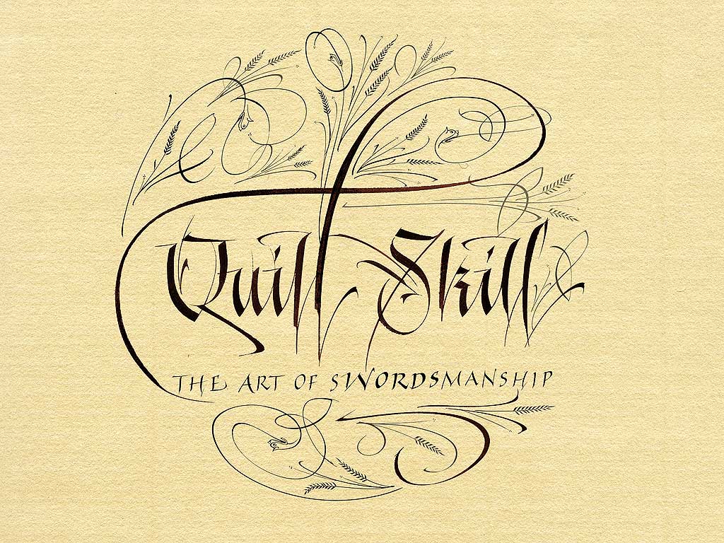
Calligraphy as a Passion of Words Intwined with Images on the Page

When an artist combines two passions, that of creating letters and images, a beautiful form of expression is born. One well known method of this combination is the art form of calligraphy.

Originating from ancient cave paintings and Egyptian hieroglyphics, the impulse for man to sync letter and image together to create a system of communication has fluctuated in terms of complication and creativeness.  In the early forms of written communication, man used only what today we would classify as images or pictures. The picture below shows the early Egyptians’ form of writing. Obviously, they found something that images could be a successful form of written communication. This is because images can express meaning just as easily as a letter. An ‘L’ can be communicated by two lines, one horizontal and one vertical meeting an angle, and, just as successfully, by a few lines that make up a lion image (as in the Egyptian alphabet). Both are images designed to communicate a meaning from human to human, the only difference is in the society in which the image/letter is used.

More recently calligraphy has become known as a form of art infused within the letters society uses every day. Now able to distinguish between the letter and the image, as opposed to their acting as one in the same, calligraphy enables the artist to communicate beauty along with the worded message. With the invention of the computor, and the various typefaces that came along with it, calligraphy almost met with its extinction; however, humanity has not lost its desire for images to portray beauty, nor the desire to derive meaning from an image. A computer-created font can seem beautiful, but it lacks the honest determination to create something new and wonderful for the world to admire. Mankind will never lose the desire to interpret the meaning behind paintings and sketches. Calligraphy is the evolution and combination of humanity’s form of expression.

Monday, November 1, 2010

Hella Jongerius

Over the summer, my mother and I were rerouted several times while attempting to catch our plane to Ireland. Of course, each time we had to be flown somewhere we had not intended to visit, we were overjoyed, but the one place that really caught my eye was Amsterdam. I was wonderfully surprised to find the beautiful fashions I saw on the people and in the shops in the Netherlands capitol. I think the reason I appreciated this fashion goldmine so was because I had never specifically herd that the Dutch people were exceedingly fashion forward.
While watching "Objectified" in my Design 001 class I was introduced to a designer whose work I found beautiful, unique, and innovative. And wouldn't you know it - she's Dutch! Mrs. Hella Jongerius.
I appreciate the beautiful way she designs vases
she claims she's channeling tradition and modernity when creating a new pot or ceramic. Jongerius made her mark in the commercial industry that all of us can relate too when she won a pitch to design the 1.5 liter Evian water bottle(never marketed). 


This woman shows such versatility in the objects she chooses to design, showing that very little can dissuade or hold her back from letting her designing mind create wonders.


This bath mat is like nothing I've ever seen before, and I feel the repletion and texture she gives to this object elevates it as not only a utilitarian product but as a piece of art.
When designing chairs, Jongerius can create such variety. Two chairs, used for the same purpose; the act of sitting, can be so completely different. As a designer, she shows that she understands the conversation of design between the creator and the recipient with the different ways in which she designs a chair.
This design shows off a sleek and simple form. With it's jet black coloring, the chair exudes professionalism, and with the inventive way that the front legs create an almost seamless line to the back of the chair is fresh and cutting edge. This chair would probably suit some buyer for a high-end company. It's nothing to outlandish to draw attention, but it has just enough subtle edge and beauty that it would be appreciated in an up-and-coming corporate environment.
To show the flip side of this coin, or chair creation, Jongerius can also design a chair that is just as much new thought and simplicity, but catered to a whole different crowd.
The bright red coloring of this stool shows that it is meant to make a statement in a room. Noticeable both for its shape and color, this simple but intriguing seat would do well in a younger person's room, maybe a dorm room in college. The brightness and new shape shouts independence and individuality.
One purpose. Two very different designs. One innovative woman.

Industrial Design: Unity in Form


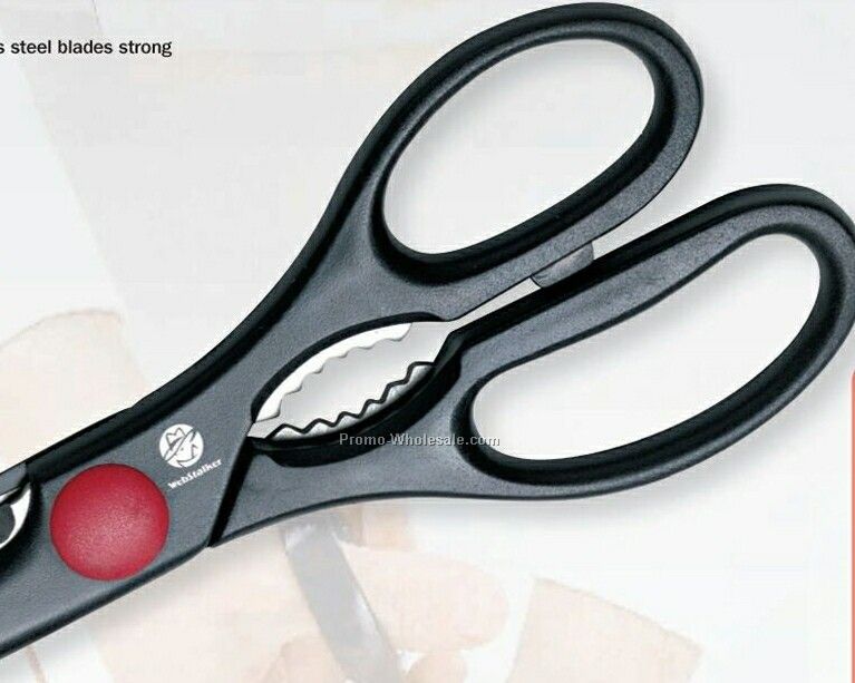
      I have a pair of stainless steel kitchen sheers sitting on my desk. As a highly useful product, it is no wonder this tool is mass produced. While many of the attributes of its design were chosen for their logical usefulness, others, like the achromatic black coloring, were chosen for aesthetic purposes. The asymmetry of the handles was incorporated in order to fit a hand more comfortably (as one handle holds four fingers, the other one, one handle is naturally longer with more room than the other). While a practical choice, there is no doubt that a certain unique visual dynamic is given to a piece of art or industrial object when asymmetry is part of the design.
      The serrated edge on one of the scissor's blades along with those in between the two handles show a pattern, repeating this module of the object in an anticipated sequence. The serration is important for the scissors to cut through tough foods in the kitchen, such as chicken bones. The designers could have stopped the serration half-way down the blade and the tool could have retained the ability to cut chicken bones, but this would be less aesthetically pleasing, so there was no reason to do so.
      The entire form of the kitchen sheers create unity. Without the asymmetrical handles, or the black coloring, or the serrated edge, the scissors would not be the successful product that they are today. A success for the industrial designer; “I like to look at it and I like to use it”!

Interaction of Content and Form in "Objectified"


      Understanding the historical content for a design idea helps us to see the reasoning behind its form and formation. In Gary Hustwit's documentary “Objectified”, 
      a designer makes the connection that the main goal of industrial design is mass production.The concept of industrial design in and of itself was an interesting topic for me. I had never really put much thought into the fact that the curve of the handle that most gardening sheers are built with these days is very helpful to me and makes them much easier to work with than old, straight-handled clippers. The design of the every-day world had never struck a chord with me while I was to busy being hypnotized by the in your face design content behind such things as fashion.
      What really grabbed my attention was when design editor, Alice Rawsthorn, brought up a historical reference as to why mass production was so key in the success of industrial design. The first emperor of China ran into a problem when he was waging war when attempting to expand his empire. If an archer died in combat, another archer could not utilize the dead man's arrows because they had been made to fit only his bow. In order to neutralize this problem, the emperor “came up with a way of standardizing the design of the arrows so that each arrow would fit any bow”, Rawsthorn explains in an interview.
      When the historical content of a major design descision is explained more understanding can be reached when observing a designed object as to why this form was chosen over that.

Sunday, October 17, 2010

Design in the Library

Design really can touch every element of your life. When at the library I noticed that every book tells a story based on its cover design. Of course, everyone has heard the old adage “don't judge a book by its cover”, but it is no secret that everyone does. This is due to the design of the cover page. Once again, my little-girl-idea that design=fashion=clothing failed me; and I could not have been happier to make another design discovery, or rather, realization.
For instance, I'm here looking at a book for my sociology class, and due to the design of its cover I can generally categorize it as a informational book or textbook.
This is an immensely helpful design because imagine my dismay if I was to search the library for a fantasy novel with adventures and romances, and every book looked like my sociology book. It would not be as easy to tell which book I want. I might be stuck desperately searching for a wonderful romantic story between this sociologist and that one. Oh, calamity!
Even the design of a book cover in the genre you prefer can help you decide between this novel and that. I'll be the first to say that when searching for a good read I'll pick a novel with a man and woman kissing on the cover over one with a man is a space suit and a gun. If a cover is creatively layed out, instead of just a beautiful image it includes a great picture, an interestingly placed title and different elements on a cover, this design will pull me in.

Comparison and Contrast

When comparing the clothing worn by women in the pre-WWI and post-WWI eras it seems that clothing was not only chose for practical purposes, but as ways of expression as well. Not much has changed in the fashion industry since then in terms of the basic reasons why women wear what they wear.
Prior to the start of World War I women wore long dresses with narrow waists and were full at the front (which became known as the “pigeon breast”). Shoulders were broad with large sleeves, and the dresses had stiff collars. The style of the 1890's-1910 was the traditional womanly figure, or the “hour glass” figure. Also, this was the final showing of the corset as a necessary part of every woman's daily outfits.
After World War I women began to change their appearance. This became the “Flapper era”, when women began to show rebellion against the fashion traditions of the time before the war. “Three important factors converged which would have an impact on American fashion: the ending of World War I, the feminist movement, and improved production methods”. Women wore cropped hair styles and short skirts. “After World War I women's fashions reflected a new more carefree attitude”. The corset was neglected and dresses were made that showed the natural waistline, or sometimes no waistline at all as with the “shift” dress. Because of the major growth in the clothing industry after the war was over, dress designs were simplified and mass-produced at lower prices. The flowing dress style was adapted by most women in society. Designs were made more practical and fitting with the desire for a carefree lifestyle after the war.(http://books.google.com/books?id=hRHUOxramGEC&pg=PA45&lpg=PA45&dq=flapper+dress+1920+feminist+movement&source=bl&ots=fJraBnPD6_&sig=nZ0w-5Ai06NxinloQeYspBokwX0&hl=en&ei=3LO7TPHCII24sQPNv4zzDg&sa=X&oi=book_result&ct=result&resnum=1&ved=0CBkQ6AEwAA#v=onepage&q&f=false)

Design as Conversation

At first mention, I thought this statement was a bit of a stretch. Sure, design could be a form of communication just as conversation is, but it could not be so broadly conceptualized as to encompass all that conversation is. I failed to see design as conversation because I considered conversation an entity that involved two sides, and at first I did not see the other side half of the conversation; I only saw the Designer.
I realize now that design is a conversation between the designer and the consumers. The designer cannot simply make an article of clothing or a graphic in a motion picture, the creation must be acknowledged by its audience. Even if the design is received poorly, with everyone who sees it going on a ten minute rant about it's disappointing qualities, design is still a conversation. An unhappy conversation, but the designer made his or her point and the recipients gave their thoughts on the topic.
Without the recipients design would be nothing. We design in order to make society run easier, be it easier on the eyes or an easier way to pick up the water bottle because of the design of the grip. Most recently the redesign of the GAP logo showed how vital the conversation of design is. GAP felt the need to create a fresh new logo. This may have been because those in charge felt they needed a new look in order to keep up with the young, up-and-coming store, but whatever the reason for the change the viewers were not buying what they were selling. Within a short time span the population made it known how little they thought of this new GAP logo, how they thought it was both unattractive and unnecessary. Following these complaints, GAP retracted the new look.
Another design conversation would be the that which Lady Gaga has with her audience. With all of her eccentric looks, Lady Gaga is certainly making statements. The singer is attempting to send messages to her viewers both through her music and through her attire. At the 2010 MTV Video Music Awards, Lady Gaga wore a dress made of meat. This choice is a perfect example of the miscommunications that can come with the conversation between the designer and the recipients. Lady Gaga chose to wear the dress to protest the military's “don't ask, don't tell” policy, but some who viewed the dress, not understanding the message the designer was attempting to get across, sent angry messages to the songstress. “It's certainly no disrespect to anyone that's vegan or vegetarian… it's [saying], 'If we don't stand up for what we believe in, if we don't fight for our rights, pretty soon we're going to have as much rights as the meat on our bones”(http://www.holamun2.com/news/quote-of-the-day/quote-of-the-day-why-lady-gaga-wore-a-meat-dress-to-the-vmas), Gaga told Ellen DeGeneres on her talk show.
Without the proper communication between designer and those who view and use the design the world of design would come tumbling down. Just like in any good conversation between two parties, messages need to be clear and well put together in order to have a successful interaction.

Monday, October 11, 2010

My First Real Outlet

When I was about 15 years, I was googling 'boho style' one day to get ideas for my own wardrobe and I came across a website that has become an important place of visitation whenever I get an urge to design. Polyvore became a place I visited every day. I could spend hours putting together an entire outfit, from boots to earrings, and then another whole hour designing the layout of my piece.
Now that I think of it, I was really exploring two of my passions when I thought I was simply feeding my impulse for one. My fashion design side loved to put together the perfect skirt with the perfect necklace, and I loved making just the right background and layout so that the entire product that showed up to the public looked all spick and span.
Before I even attempted to use a sewing machine and create my own pieces out of actual physical materials, I turned to Polyvore to sate my thirst for fashion and design. The great thing was that Polyvore provided an almost limitless library of clothing and they were actual pieces of clothing found in stores and boutiques around the world. I enjoyed the possibility that if I were rich I could just set off on a plane and buy an entire outfit that I had just put together. The idea that the outfit I just designed could actually be worn by someone out there, was oddly liberating!
Once I got more into the idea of design as a career, I used the Polyvore site less and less because I didn't like the fact that the pieces of clothing were already out there. Someone else had designed these beautiful dresses and scarves and I was simply borrowing them; I was personal shopping for my own little virtual, invisible paper doll. I wanted to be the one who designed the actual shirt that I found so gorgeous. I was just dressing a manikin on Polyvore, and while at one time I actually thought I would really love to actually do that for a living, I had moved on and was aspiring to bigger and better things.
I recently revisited Polyvore after a long period of absence and am once again enjoying the designing the outfits I can throw together on a whim or with much thought. But now I know I'm enjoying it as a great hobby. I thank the Polyvore site for providing a stepping stone for my creative identity, and I hope it will continue to provide the same outlet for some young designers/artists out there in the future.

Creativity from Without

Before this Design course I had always considered the most beautiful art to be the result of someone looking deep inside his or herself and bringing what they found there out into the world in a beautiful way. However, this thought of finding inspiration from what we see, feel, touch, and taste all around us is just as important as the creations inspired from within. Along with this realization came the one that I had already been creating by this method of inspiration.
While most of my artwork has been inspired by the emotions that I see under my own skin, I've always been moved by the work of the internationally renowned entertainment company, Cirque du Soleil. Both the acts and the costumes of the productions that Cirque puts on take my breath away, and one day I hope to watch them perform live.
Though their stunts inspire the most intense emotions of fear, passion, and joy, which can all be tapped to create a work of wonder, it is their expressive faces under all that color and the way their bodies form unprecedented shapes in those vivacious costumes that have inspired my paintings and even my poetry.
The way the colors and layout of the costume, whether the make-up or the outfit, intensify the emotion that the performers are portraying proves what an immense role design has in such a famous industry. I paint more expressively, with wider and wilder brush strokes and more passionate abandon, after recently viewing a Cirque du Soleil still shot or youtube video. I believe some of my best work is inspired by the vibrant hues that cover the entire scenes on the Cirque stage.(http://www.sweetspot.ca/SweetLife/gifts_and_occasions/8321/cirque_du_soleil__cirque_2009/)

"Stone Soup" Project

“Design is about collaboration” said my Professor Housefield. Since we've been small we've all been taught to share. Neighbors share cups of sugar. Countries share resources when it is beneficial for both parties. To sum up, sharing for the benefit of all has, pretty much, been carved in stone for our society.
In the story of Stone Soup, the soldiers create camaraderie out of exclusion and mistrust. Joy is made from a multitude of people taking their knowledge and resources and adding it to the massive pot of stewing, tasty creativity. With this Stone Soup project of creating a piece of art out of unused objects, garbage, and neglected bobbles, Housefield applied the same principle to Design. Without cooperation and collaboration, both the act and the product of design would be sold to the world without its best foot forward. When working together on a project, Designers conceive a myriad of brilliant ideas and details that might have been overlooked had not that one specific person been involved in its creation. We help one another to produce the best we can produce.
In my group's project, each person gave a unique touch to the piece. Without Gina's impressive leadership skills and general positive attitude our creation would not have been constructed with such ease. Taylor created great little additions to the model with her glitter-covered cardboard cutouts. Valerie provided the glitter glue that became our go-to tool and Libby decked out an entire side of the piece with her intricately placed green strawberry containers. Tanya, Chinh, Alyssa, and I all put in our two cents with the construction of cardboard stairs, or the addition of a flag on top, or a decoratively wrapped Martinelli's bottle with a ping pong ball glued on top. Suiwa provided a laugh as well as the finishing touch with the little stuffed duck she placed on top of our masterpiece.
The final product could not have been erected without the input of all our members. I'm sure that in each of our future design projects, be they graphic, fashion, or architectural in nature, the suggestions and aid we receive from others who are just as passionate about that creation as we are will cause a piece of design to be produced; one even more ravishing than our cardboard masterpiece!

Saturday, October 2, 2010

Combining Passions: First Annual Vegan Fashion Show

In lecture on Tuesday, my professor mentioned a Vegan Fashion Show that is happening today actually, Oct. 2, in San Francisco. At first I didn't really understand the connection and didn't think much about it, but of course, being the astoundingly proficient student that I am, I jotted down the note just for good measure. While sitting in my dorm room and mulling over what to blog about I glanced through my notebook and saw Tuesday's note. With curiosity, I looked into it on the trusty web!
A vegan fashion show! Part of the World Vegetarian Festival. Once I read into it, the concept became truly fascinating! Designers and artists seem to be passionate people in general, but to have someone who is so passionate about multiple things and to fuse those passions into one inspired project is a really beautiful notion.
Karen Brighten Events is behind the organization of the fashion show, and this woman really seems to have her ducks in a row and an eye on the prize. She hopes to bring her dream of a healthy world closer to the mainstream lifestyle and “is committed to reducing the environmental impact that events can have on the planet” (http://sfveganfashionshow.com/?page_id=2). Brighten has teamed up with models and designers who share her goals and interests in preserving humanity by erasing cruelty to animals and promoting harmony with the environment. Laura Collins, the designer for Pansy Maiden, has added her “cruelty-free” handbags to the show and Reco Jeans has also donated their recycled denim styles to Brighten's event.

Both of these designers, among others, are contributing their fantastic ideas, styles, and compassion to the dream that one day the world will mesh looking good with feeling good morally. And though I claim no vegan title, I can say with much enthusiasm, that I admire what these environmentalists are doing; pushing their dreams to the surface with design as a attention-grabbing lead rope into the fray of society.

Continuous Journey Through Design


I love how many options there are in the world of design. When I was little, I thought design simply meant you make something pretty ergo you have designed. And due to my belief at that time that clothes were some of the few truly pretty things out there in the world, I thought Design=Fashion=Me. Isn't it strange how you grow up and see more of the world, your eyes are opened, and suddenly there before you feet are options!
I first noticed that there was more to design in the world than just clothing when I was in, I believe it was, my Aunt's home in Oklahoma and I realized I was so happy just sitting in her living room and looking at the way she arranged her furniture, and the furniture itself; how the wood on the bottom of the sofa was slightly arched in such an attractive way. And the beautiful vintage fainting sofa with the rich green upholstery. Her entire sitting room was like a work of art; beautifully put together, in color, arrangement and furniture form, as well as effectively creating an atmosphere of calm and peaceful grace simply by the choice of furniture and how she placed it about the room. My view of design was expanding.
While in high school, creating poster boards and visual aids for my various book projects and other assignments became a great joy. I quickly realized this was because this was something I was good at. I always received praise for my creative layouts and how my poster was different, not simply for the effort put into it, but because it was so artfully put together. Around this same time I understood that I enjoyed flipping through some magazines more than others (for example, Vogue and the Anthropology catalogue are much more intriguing to look at than, say, OK! Magazine). The way in which these articles and images were placed together on a page was esthetically pleasing in a way that other magazines were not. Design was much, much more than just clothing!
Now that I am starting in the design program at UC Davis, I am understanding even more that design is found everywhere, not just a shoe, or a chair, or a magazine spread, design is all around us.

First Design Experiences


A princess' private chamber; that was the view I saw. Soft pinks, purples, and an overall wash of paisley made my little-girl/budding-designer-self melt into easy comfort. A vast ocean of imperfect wood swept across the top of her bedroom. It was an expanse of nature's notched wood to house her sleeping form. I would close the door that matched the color of the wooded ceiling and immediately peer left. A grand mirror stretching all the way from the fuzzy blue carpet to the above washed brown planks. My small stature was always a picture of aw when I gazed up at this huge reflective wall. Again, I always thought, 'Only a princess would have such a large mirror upon her wall.' The walls of her bower were sprinkled with lilies of white and soft pink. I remember loving to trail my finger across the wallpaper because it had an indescribable texture, like sandpaper but soft; more like the dust that sandpaper leaves behind. On the far side of the room was a mantle made of burgundy and light brown bricks with a small gas fireplace. The scene was made perfect when I would perch on that warm fireplace and watch winter pass through the large windows that took up a majority of the wall from the far corner. An enormous bed took up one forth of the sizable room. Always decorated in the most beautiful bed skirts and linens, the bed was just the right size to engulf a happy little girl within it's perfect and fluffy down blankets. Knowing the joy that it brought to my youth, and spying the overall grandeur, I would not be surprised if my grandmother was inspired, while designing her adult bedroom, by the memories of her own childhood when she was in love with fairytale castles too.